import requests
import datetimeIn this notebook, we will download data about earthquakes in Nepal from USGS and produce a dashboard to explore the data interactively.
Getting the Data
The data is freely available from USGS’s Earthquake Catalog.
The API supports a number of query parameters, but we need only a subset of those, particularly to limit the search to Nepal’s geographical bounds and since 2010. We’ll also limit the results to include earthquakes > 4 in magnitude.
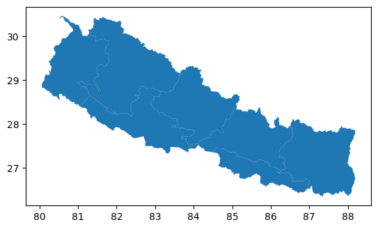
CATALOG_URL = "https://earthquake.usgs.gov/fdsnws/event/1/query.csv?"To get the geographic bounds of Nepal, we will read a parquet file using the geopandas library. Let’s see what this looks like.
import geopandas as gpdWe only care about the boundaries, so let’s dissolve the internal boundaries and get the geographical bounds.
nepal = nepal.dissolve()
nepal.bounds| minx | miny | maxx | maxy | |
|---|---|---|---|---|
| 0 | 80.057081 | 26.347758 | 88.201526 | 30.471487 |
Now we’re ready to query the catalog. We’ll save the results as a CSV file ‘quakes.csv’.
params = {
"starttime": "2010-10-07",
"endtime": str(datetime.date.today()),
"maxlatitude": nepal.bounds["maxy"],
"minlatitude": nepal.bounds["miny"],
"maxlongitude": nepal.bounds["maxx"],
"minlongitude": nepal.bounds["minx"],
"minmagnitude": 3,
}
response = requests.get(CATALOG_URL, params=params)
with open("quakes.csv", "wb") as f:
f.write(response.content)Filtering the results
We’ll read the CSV file as a pandas DataFrame first and then convert it to a GeoDataFrame with geopandas.
import pandas as pdquakes = pd.read_csv(
"quakes.csv",
parse_dates=["time"],
dtype={
"latitude": "float32",
"longitude": "float32",
"depth": "float32",
"mag": "float32",
},
usecols=["time", "latitude", "longitude", "depth", "mag", "place"],
)
quakes = gpd.GeoDataFrame(
quakes,
geometry=gpd.points_from_xy(quakes["longitude"], quakes["latitude"]),
crs=nepal.crs,
).drop(columns=["longitude", "latitude"])The time is currently in UTC, lets convert that that ‘Asia/Kathmandu’
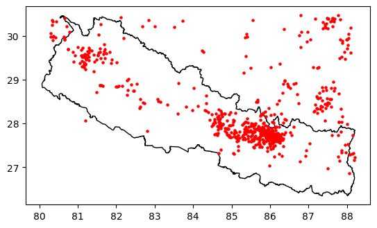
quakes["time"] = quakes["time"].dt.tz_convert(tz="Asia/Kathmandu")Let’s visualise the earthquakes now.
The results include all earthquakes located within the rectangular geogrpahical bounds. We can see earthquakes recorded in China and India.
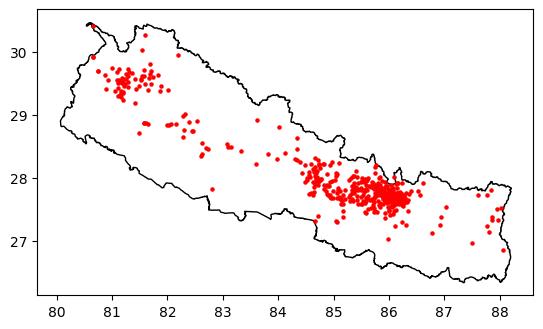
To fix this, we’ll use the within function provided by geopandas to filter only those within Nepal’s boundary.
Interactive Visualisation
Now that we have downloaded and filtered the data, we’ll improve on the static map and produce an interactive map. We’ll use the holoviews and geoviews libraries to achieve this. In this case, we’ll use the bokeh backend for plotting.
import holoviews as hv
import geoviews as gv
hv.extension("bokeh")We only need to plot Nepal’s boundary, so we’ll use the Path method of geoviews instead of Polygons.
nepal_map = gv.Path(nepal).opts(
color="black",
xaxis=None,
yaxis=None,
data_aspect=1,
responsive='width'
)Next, we’ll plot the earthquakes as points on the map. We’ll visually relate the size of the earthquakes with the corresponding markers on the map. We’ll define a method to generate the point plot, and holoviews allows us to modify the output of this method by chaining opts later.
def plot_quakes(data):
return gv.Points(data).opts(
size=(2 ** gv.dim("mag")) / 4,
fill_alpha=0,
toolbar="above",
show_legend=True,
)This time, we want to provide some information about the earthquake (e.g. date, magnitude, etc.) when a user hovers over a point on the map. For this, we’ll use the HoverTool provided by bokeh.
from bokeh.models import HoverTool
from bokeh.models.widgets.tables import NumberFormatterhover_tool = HoverTool(
tooltips=[
("Date", "@time{%d %b %Y %I:%M %p}"),
("Magnitude", "@mag{0.0}"),
("Place", "@place"),
("Depth", "@depth{0.00} kms"),
],
formatters={"@time": "datetime"},
)nepal_map * plot_quakes(quakes).opts(tools=[hover_tool])We can improve this further by indicating how far in the past the earthquakes occurred. To achieve this, we’ll create the following bins:
- < 1 day
- 1 - 7 days
- 7 - 30 days
- 30 - 365 days
- older
quakes["timebin"] = pd.to_datetime("now").tz_localize("UTC") - quakes["time"]
bins = [
pd.Timedelta(seconds=0),
pd.Timedelta(hours=24),
pd.Timedelta(days=7),
pd.Timedelta(days=30),
pd.Timedelta(days=365),
pd.to_datetime("now").tz_localize("UTC") - min(quakes["time"]),
]
labels = [
"past day",
"past week",
"past month",
"past year",
"older",
]
quakes["timebin"] = pd.cut(quakes["timebin"], bins, labels=labels)quakes[["time", "timebin"]].head(5)| time | timebin | |
|---|---|---|
| 0 | 2024-09-15 00:06:42.274000+05:45 | past year |
| 1 | 2024-08-31 03:46:59.157000+05:45 | past year |
| 7 | 2024-05-28 06:58:06.793000+05:45 | past year |
| 8 | 2024-03-06 10:10:08.225000+05:45 | past year |
| 10 | 2024-01-12 23:32:29.479000+05:45 | past year |
nepal_map * plot_quakes(quakes).opts(
color="timebin", cmap="Dark2", fill_alpha=0.5, legend_cols=3, tools=[hover_tool]
)Interaction with Filtering
HoloViews provides the HoloMap container, which is supported by a multi-dimensional dictionary of objects. We can then explore the data along those dimensions. See here for the official examples.
HoloMap produces the plot together with widgets corresponding to the dictionaries for exploration. By default HoloMap’s widgets are placed to the right of the plot, which is not very suitable for our rectangular map. So, we’ll place the widgets at the bottom using hv.output.
hv.output(widget_location="bottom")When displayed as a webpage using Quarto by converting to HTML, HoloMap creates plots for each unique combination of dimension(s) because we don’t have a phython server to support dynamic generation of plots. Therefore, we’ll limit the values of our dimensions.
Ideally you’d produce a dashboard supported by a python server which would allow us to explore all key dimensions. For how to do that, read below.
First, we’ll create the dimensions
from math import flooryears = [2010, 2015, 2020]
kdims = [
hv.Dimension(("start_year", "Since"), default=2010),
hv.Dimension(("min_magnitude", "Minimum magnitude"), default=3),
]
min_mag, max_mag = min(quakes["mag"]), max(quakes["mag"])
mag_bins = [i for i in range(floor(min_mag), round(max_mag))]Next we’ll define a method that generates the plot for a given (year, min_magnitude) combination, and bind this to the HoloMap container.
def plot_filtered_quakes(start_year, min_mag):
data = quakes[(quakes["time"].dt.year >= start_year) & (quakes["mag"] >= min_mag)]
# Here, we need to handle cases where there's no earthquake records.
if not len(data):
return nepal_map * gv.Points([]).opts(tools=[hover_tool])
return nepal_map * gv.Points(data).opts(
size=(2 ** gv.dim("mag")) / 4,
color="timebin",
cmap="Dark2",
fill_alpha=0.5,
toolbar="above",
tools=[hover_tool],
show_legend=True,
)
map_dict = {
(y, m): plot_filtered_quakes(y, m) for m in mag_bins[:-1] for y in [2010, 2015, 2020]
}
hmap = hv.HoloMap(map_dict, kdims=kdims)hmapDashboard with DynamicMap and Panel
HoloViews plots can be dynamically linked with panel widgets, which allows the widgets to act as input to control the range of values shown in the plots. In this case we’ll use the DynamicMap container which use callables to return HoloViews object using the python server, instead of the HoloMap way of pre-rendering plots for all possible dimension combinations.
For our map, we will use a date slider widget to filter earthquakes within a date range, and a min magnitude widget to filter the minimum magnitude of the earthquakes.
import panel as pn
pn.extension()Date Slider
We’ll create a slider that allows us to select any range of dates within our data.
last_date = quakes["time"].max()
earliest_date = quakes["time"].min()
date_slider = pn.widgets.DateRangeSlider(
name="Date Range",
start=earliest_date,
end=last_date,
value=(earliest_date, last_date),
)Minium Magnitude
The next widget will allow us to filter by the minium magnitude of the earthquake.
min_magnitude = pn.widgets.IntSlider(
name="Minimum Magnitude",
value=3,
step=1,
start=3,
end=floor(quakes["mag"].max()),
)Let’s wrap the widgets in panel’s WidgetBox layout that nicely arranges the widgets for us.
widgets = pn.layout.WidgetBox(date_slider, min_magnitude)
widgetsBinding the widgets with the Map
Now that we’ve created the widgets, we will bind these widgets with a method that will filter the data accordingly and call the plot_quakes method we defined earlier to plot the earthquakes on a map.
def plot_filtered_quakes(date_range, min_mag):
try:
dates = [pd.to_datetime(x).tz_localize("UTC") for x in date_range]
data = quakes[
(quakes["time"] > dates[0])
& (quakes["time"] < dates[1])
& (quakes["mag"] >= min_mag)
]
except TypeError:
data = quakes
return nepal_map * gv.Points(data).opts(
size=(2 ** gv.dim("mag")) / 4,
color="timebin",
cmap="Dark2",
fill_alpha=0.5,
toolbar="above",
data_aspect=1,
responsive='width',
tools=[hover_tool],
show_legend=True,
)
quakes_map = pn.bind(
plot_filtered_quakes, date_range=date_slider, min_mag=min_magnitude
)
quakes_dmap = hv.DynamicMap(quakes_map)pn.Column(quakes_dmap, widgets)Custom Legend for Earthquake Size
Lastly, we would like a legend to show what the sizes of the circles means. Unfortunately, the bokeh backend we’re using for holoviews doesn’t support a legend with different marker sizes. So, we’ll create a custom plot that mimics a legend and add that to the plot.
First, let’s create bins to place the earthquakes in: starting with 4 (the lowest possible) to the max recorded.
mag_bins += [round(max_mag, 2)]
mag_bins[3, 4, 5, 6, 7, 7.8]Now we determine the marker sizes for these, as well as their positions on the y-axis, as we’ll create a vertical legend. If we wanted a horizontal legend, we’d swap the x and y positions.
marker_sizes = [2**x / 4 for x in mag_bins]
xs = []
for i, s in enumerate(marker_sizes):
x = (xs[i - 1] + 0.1 + s / 100) if i > 0 else 0
xs += [x]
marker_data = dict(
x=xs,
y=[0] * len(mag_bins),
mag=marker_sizes,
)
marker_data{'x': [0, 0.14, 0.32, 0.5800000000000001, 1.0, 1.6571523605095195],
'y': [0, 0, 0, 0, 0, 0],
'mag': [2.0, 4.0, 8.0, 16.0, 32.0, 55.71523605095194]}We also need labels, one before the first marker, and one after the last marker. This will be a bit a of a trial and error in terms of positioning the labels to your satisfaction.
mag_labels = hv.Labels(
{
("x", "y"): [(xs[0] - 0.2, 0), (xs[-1] + 0.55, 0)],
"text": [f"{mag_bins[0]}", f"{mag_bins[-1]}+"],
},
["x", "y"],
"text",
).opts(text_color="black", text_font_size="10pt")Let’s see what our legend looks like.
mag_points = hv.Points(marker_data, vdims=["mag"]).opts(
size="mag",
color="gray",
fill_alpha=0,
toolbar=None,
ylim=(-0.2, 0.2),
xlim=(-0.25, 2.5),
height=100,
width=250,
xaxis=None,
yaxis=None,
show_frame=False,
title="Magnitude",
)
mag_legend = mag_points * mag_labels
mag_legendNow we can add this legend with the map to complete our interactive map.
pn.Column(quakes_dmap, pn.Row(widgets, mag_legend, align="center"))If you were to run this in Jupyter Lab or as part of a dashboard, you’d be able to do lag-free filtering using the python server. For an example of a work in progress dashboard see here.


