library(dplyr)
library(purrr)
library(data.table)
library(jsonlite)
library(arrow)The Qld government’s Open Data Portal provides the crime location API. This API gives us a list of reported offence, type of office and geographic location (such as suburb and ABS meshblocks).
One of the APIs let’s us lookup offences by geographic location and date ranges. It looks like this: > https://a5c7zwf7e5.execute-api.ap-southeast-2.amazonaws.com/dev/offences?locationType=Lga&startDate=06-26-2019&locationName=Brisbane&endDate=08-26-2019&format=JSON
locationTypecan be one of SUBURB, LGA, DIVISION, REGION, DISTRICT, NHW, POSTCODE, PATROLGROUP, and is case sensitive.startDateandendDateweirdly require the mm-dd-yyyy formatformatis one of XML, JSON,SQL,JSONP
Getting the data
I have downloaded the stats for all Brisbane suburbs (from 01/012020 to 31/05/2025). I won’t go into the details of how the data was downloaded, as it’s a trivial task.
I will also save the data as a parquet file to faster reads in the future.
# if the parquet file exists, read it; otherwise read the json files
parquet_fpath <- "brisbane-crime-stats.parquet"
if (file.exists(parquet_fpath)) {
    df <- read_parquet(parquet_fpath)
} else {
    # read all json files into one dataframe
    df <- list.files(path = "crime-stats", pattern = "*.json", full.names = T) %>%
      map_df(~read_json(., simplifyVector = TRUE))

    # write to parquet for later use
    write_parquet(df, parquet_fpath)
}

# convert to data.table
dt <- setDT(df)

# change data types of columns
dt[, `:=`(
    Type = factor(Type),
    Suburb = factor(`Area of Interest`),
    `Area of Interest` = NULL, # drop this column
    Postcode = NULL, # I won't use postcodes in this notebook
    Date = as.IDate(Date)
)]

# Remove " - Brisbane" from suburb names
dt[, Suburb := stringr::str_replace(Suburb, " - Brisbane", "")]
Most common criminal offence types
Let’s first visualise the most frequent criminal offence types as reported to police.
library(ggplot2)
library(patchwork)
library(scales)
data <- dt[, .N, by = Type] # total of all reports groupbed by Type
ggplot(data, aes(y = reorder(Type, N), x = N)) +
geom_bar(stat = "identity") +
scale_x_continuous(
labels = label_number(scale_cut = cut_short_scale())
) +
labs(
title = "Frequency of different offence types recorded in Brisbane",
subtitle = "Between 01/01/2020 and 31/05/2025",
caption = "Source: Queensland Government",
y = "",
x = "Number of reported offences"
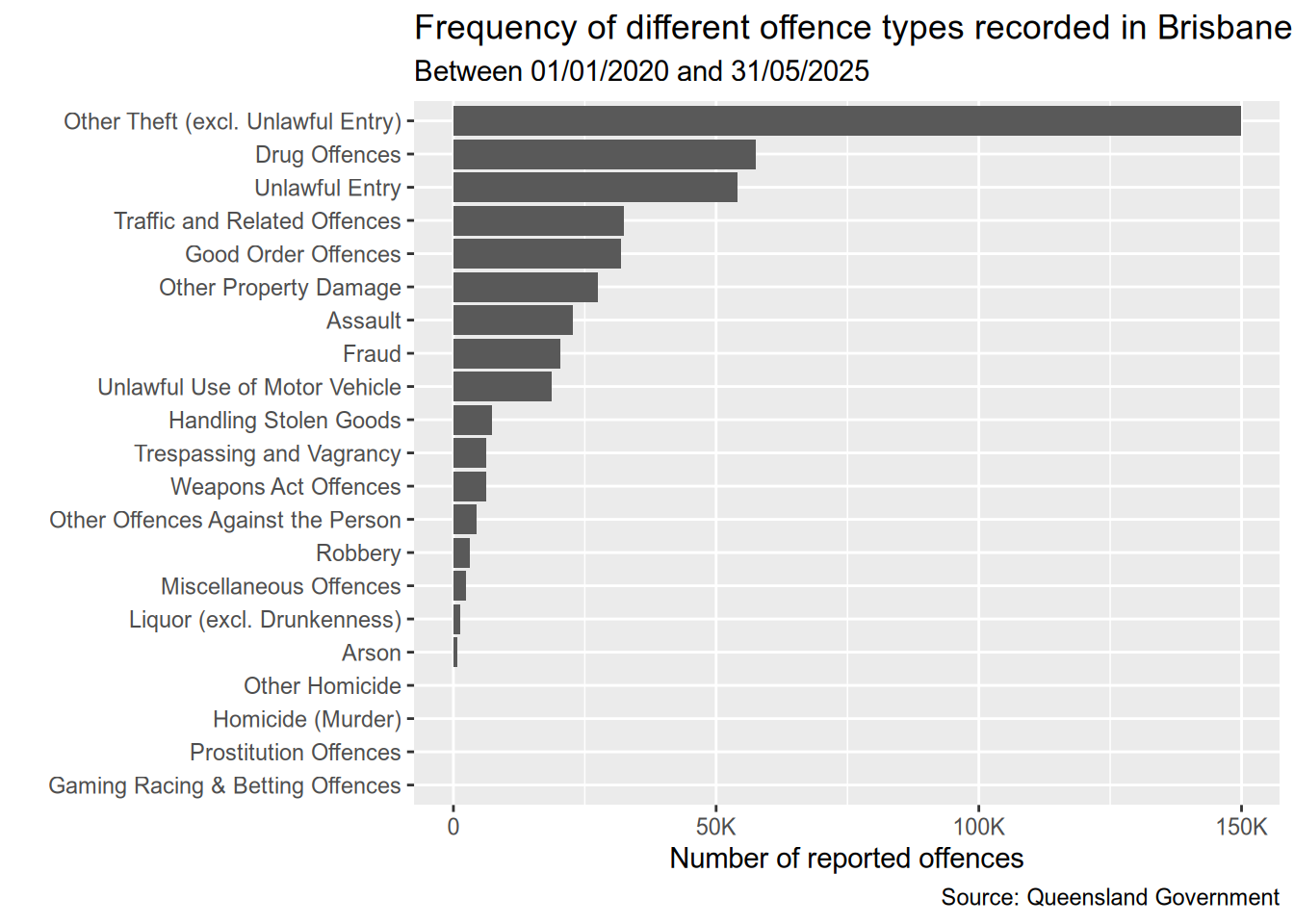
)We can see that Theft is the by far the most common crime in Brisbane, followed by Drug Offences and Unlawful Entry. We can also see that the top nine offences are much frequent than the rest. So I’ll focus on them from here on.
most_common_types <-  dt[, .N, by = Type][order(-N)][1:9, Type]
dt <- dt[Type %in% most_common_types]
Temporal trends for offence types since 2020
I want to look at the temporal trends for the different offence types. More specificially, which offence types were trending upward and which ones were trending downward since 2020.
slopes <- dt[
    , .N, by = .(Date, Type) # first sum all offences by date and type
][
    # then fit a linear model, and get the slope
    , coef(lm(N ~ Date))[1], by = Type
]
Having calculated the slopes, we can now separate those offence types with an upward trend from those with a downward trend. Then we can plot them separately instead of crowding in a single chart.
# this time, we get those with slope < 0
data <- dt[
    Type %in% slopes[V1 < 0, Type],
    .N,
    by = .(Date,Type)
]
p1 <- ggplot(data, aes(x = Date, y = N, colour = Type)) +
    geom_smooth() +
    scale_color_brewer(palette = "Set1") +
    labs(
        title = "Upward trending offence types",
        x = "",
        y = "Number of offences reported"
    )

data <- dt[
    Type %in% slopes[V1 >= 0, Type], # only those with a slope >= 0 (increasing trend)
    .N, # sum all
    by = .(Date,Type) # grouped by date and type
]
p2 <- ggplot(data, aes(x = Date, y = N, colour = Type)) +
    geom_smooth() +
    scale_color_brewer(palette = "Set2") +
    labs(
        title = "Downward trending offence types",
        x = "",
        y = "Number of offences reported"
    )


(p1 / p2) + plot_annotation(
    title = "Temporal trends in criminal offence reported by types",
    subtitle = "As reported between 01/01/2020 - 31/05/2024",
    caption = "Source: Queensland Government"
)
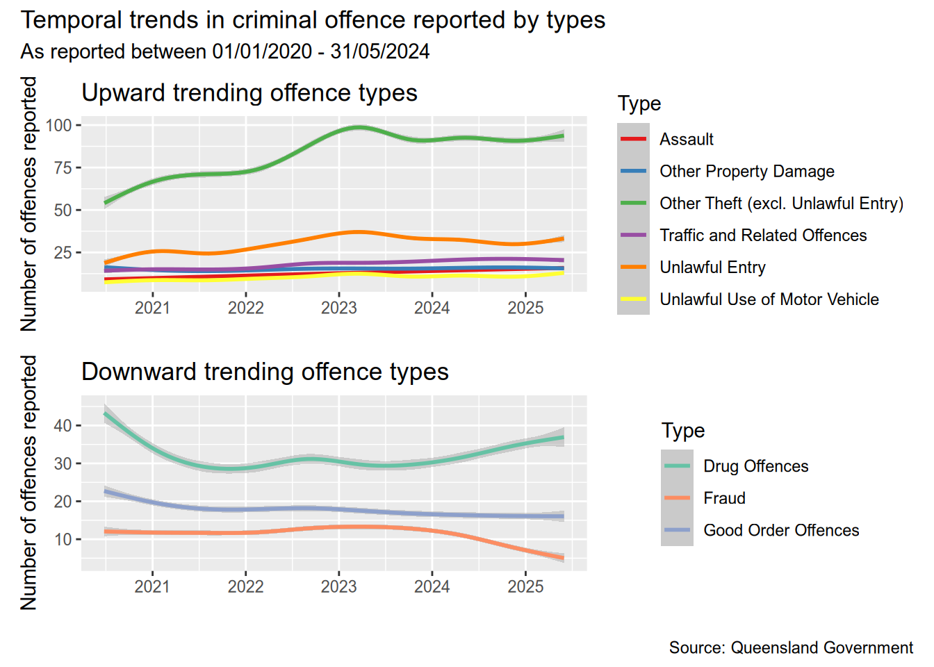
The most obvious upward trend is in the number of thefts, and we can see that from the beginning of 2024. Reported thefts sharply increased from 2020 until early 2023, after which the number of thefts has more or less stabilised. On the other side, the number of frauds reported has fallen quite sharply. Drug related offences have started increasing again after falling during 2021-2024 (Covid??).
Another interesting observation is that unlawful entry, unlawful use of motor vehicle, and theft rise and fall together. I’m not sure if one incident could have all three crimes reported separately. These crimes also tend to see a sharp seasonal increase towards the end of the year and fall back after the around March. The sharpest increase in thefts was, however, from July 2022 to December 2022.
Temporal trend of the three most common crimes
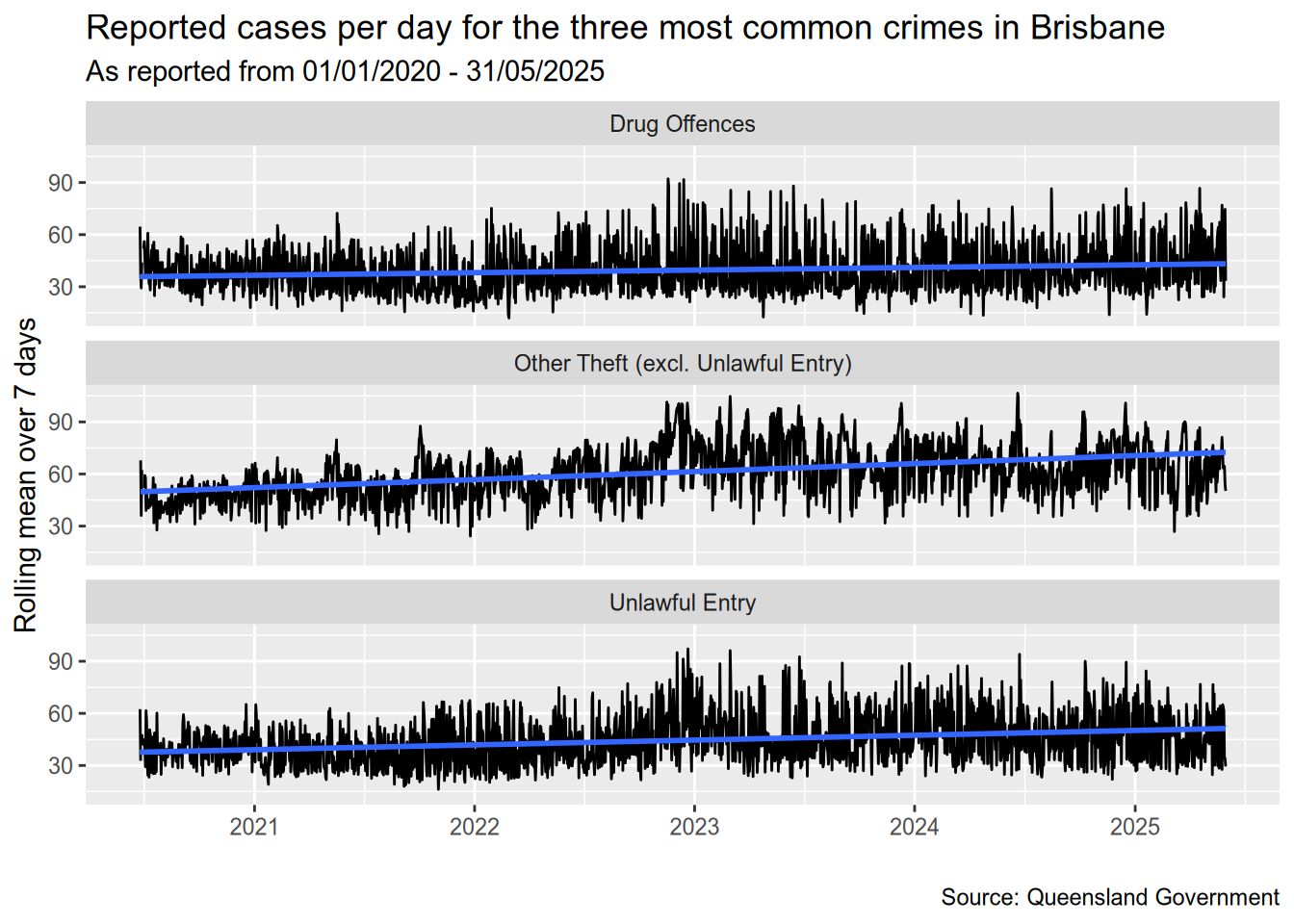
Let’s also look at a detailed timeline for the three most common offence types.
data <- dt[Type %in% most_common_types[1:3], .N, by=.(Date, Type)][, .(Date, Type, rN = frollmean(N, 7))]

ggplot(data, aes(x=Date, y=rN)) +
    geom_line() +
    geom_smooth(method="lm") +
    facet_wrap(vars(Type), ncol=1) +
    labs(
        title = "Reported cases per day for the three most common crimes in Brisbane",
        subtitle = "As reported from 01/01/2020 - 31/05/2025",
        caption = "Source: Queensland Government",
        x = "",
        y = "Rolling mean over 7 days"
    )
`geom_smooth()` using formula = 'y ~ x'Warning: Removed 6 rows containing non-finite outside the scale range
(`stat_smooth()`).Are theft and unlawful entries more likely on particular days?
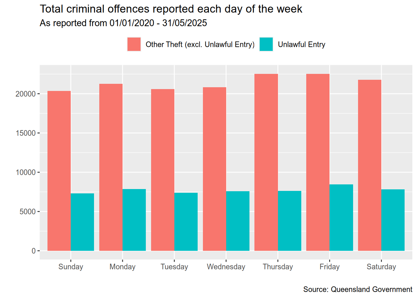
I was also curious if theft and unlawful entries are more likely to occur on particular days of the week.
theft_and_unlawful_entry <- c("Other Theft (excl. Unlawful Entry)", "Unlawful Entry")
data <- dt[Type %in% theft_and_unlawful_entry, .(DayOfWeek = factor(weekdays(Date)), Type)][, .N, by = .(DayOfWeek, Type)]
days_of_week <- c("Sunday", "Monday", "Tuesday", "Wednesday",
"Thursday", "Friday", "Saturday")
ggplot(data, aes(x = factor(DayOfWeek, days_of_week), y = N, fill = Type)) +
geom_bar(stat = "identity", position = "dodge") +
labs(
x = "",
y = "",
title = "Total criminal offences reported each day of the week",
subtitle = "As reported from 01/01/2020 - 31/05/2025",
caption = "Source: Queensland Government"
) +
theme(
legend.position = "top",
legend.title = element_blank()
)It looks like the day of the week doesn’t make a significant difference in terms of the number of unlawful entries reported. The most number of thefts seem to be reported on Thursdays, Fridays, and Saturdays but the difference isn’t much.
Geographical distribution of offences
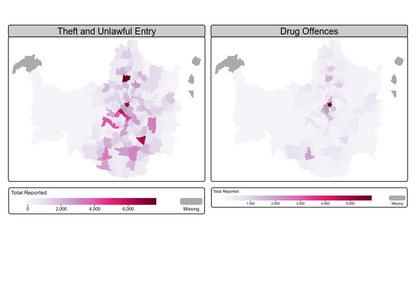
Finally, let’s look at the geographical distribution of offences by suburbs for the top three offence types and check for any patterns, if they exist. The top three types are: Theft, Drug offences, and Unlawful entry.
For this task, I’ll combine Unlawful entry and Theft in one plot, and Drug offences in the other.
theft_and_unlawful_entry <- c("Other Theft (excl. Unlawful Entry)", "Unlawful Entry")
theft_and_unlawful_entry <- dt[Type %in% theft_and_unlawful_entry, .N, by=`Suburb`]
theft_and_unlawful_entry[, Type := "Theft and Unlawful Entry"]

drug_offences <- dt[Type == "Drug Offences", .N, by=.(Type, `Suburb`)]
data <- rbind(drug_offences, theft_and_unlawful_entry)

# make wider to easily work with tmap
data <- dcast(data, `Suburb` ~ Type, value.var = "N")

# replace NA with 0
setnafill(data, fill = 0, cols = c("Drug Offences", "Theft and Unlawful Entry"))library(sf)Linking to GEOS 3.13.1, GDAL 3.11.0, PROJ 9.6.0; sf_use_s2() is TRUElibrary(stringr)
library(tmap)# I'll exclude the Moreton Island suburbs here.
moreton_island_suburbs <- c("Bulwer", "Cowan Cowan", "Kooringal", "Moreton Island")
suburbs <- read_sf('brisbane-suburb-boundaries.geojson') %>%
select(c("SUBURB_NAME", "geometry")) %>%
mutate(SUBURB_NAME = stringr::str_to_title(SUBURB_NAME)) %>%
filter(!(SUBURB_NAME %in% moreton_island_suburbs))
by <- join_by(SUBURB_NAME == Suburb)
data <- left_join(suburbs, data, by)m <- tm_shape(data) +
tm_polygons(
lwd = 0,
fill = c("Theft and Unlawful Entry", "Drug Offences"),
fill.scale = tm_scale_continuous(values = "brewer.pu_rd"),
fill.legend = tm_legend(
title = "Total Reported",
title.size = 0.8,
orientation = "landscape"
),
# col.free = c(TRUE)
) +
tm_facets(ncol=2)
m[plot mode] fit legend/component: Some legend items or map compoments do not
fit well, and are therefore rescaled.
ℹ Set the tmap option `component.autoscale = FALSE` to disable rescaling.Putting everything together
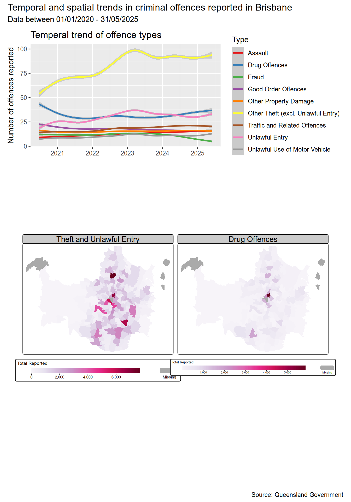
Now, time for me to try and put all this information together in one visualisation.
trend_data <- dt[, .N, by = .(Date,Type)]
p1 <- ggplot(trend_data, aes(x = Date, y = N, colour = Type)) +
    geom_smooth() +
    scale_color_brewer(palette = "Set1") +
    labs(
            title = "Temperal trend of offence types",
            x = "",
            y = "Number of offences reported"
    )

(p1 / tmap_grob(m)) +
    plot_layout(heights = c(2, 6)) +
    plot_annotation(
        title = "Temporal and spatial trends in criminal offences reported in Brisbane",
        subtitle = "Data between 01/01/2020 - 31/05/2025",
        caption = "Source: Queensland Government"
    )